Our brand is more than just a mark. It’s a perception made up of both tangible elements, such as recognizable signs like our logo, marks and colouring, as well as intangible elements relating to our promise, positioning and personality. It’s a carefully created system that requires some consideration when using it.
Logo
Our logo is one of the most important parts of our visual identity and should never be altered. Below we’ve listed and explained the various treatments of our logo.
Primary logo
Our logo is clean, simple and uncomplicated. It’s friendly and approachable — much like us.
(SVG, EPS, PNG)
Secondary/Vertical logo
Sometimes, it might be necessary to use a more vertical version of our logo due to restriction of the placement itself. In these rare instances, use this version of the logo.
(SVG, EPS, PNG)
Clear space
There must always be sufficient space surrounding the logo to avoid competition from other visual elements and to maintain its visual impact.
The area of isolation represents the minimum clear space that must be provided at all times. This area is determined by the height of the letter forms in the Teamwork.com logo and is proportional, regardless of logo size.
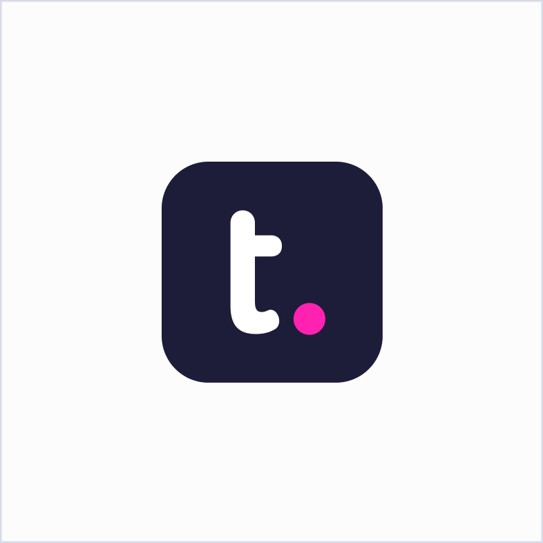
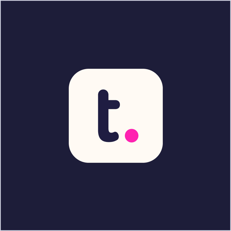
Our symbol
Our symbol should be used in place of the full logo, where the logo visibility could be compromised.
Our symbol should be used in isolation and never with the primary logo.
(SVG, EPS, PNG)
Usage
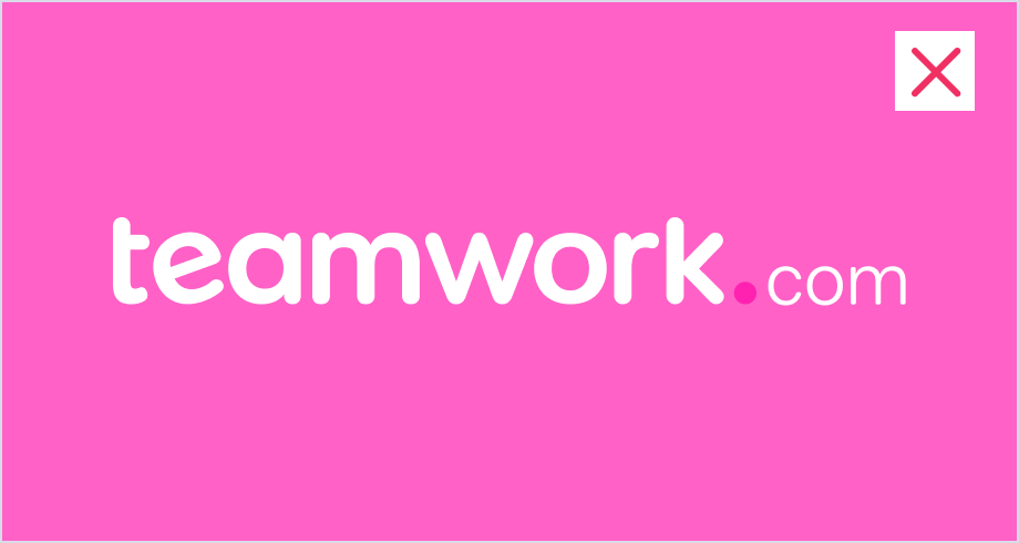
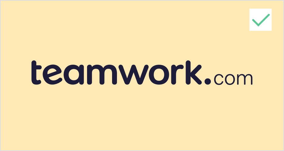
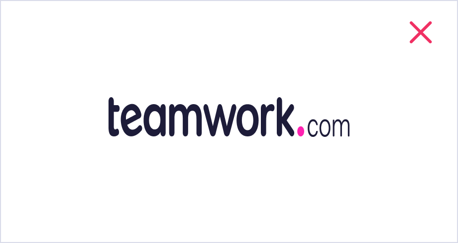
Our default logo is slate grey with a pink dot. This should only ever appear on a white (or near white) background. Make sure all the colors of the logo have enough contrast against the background.
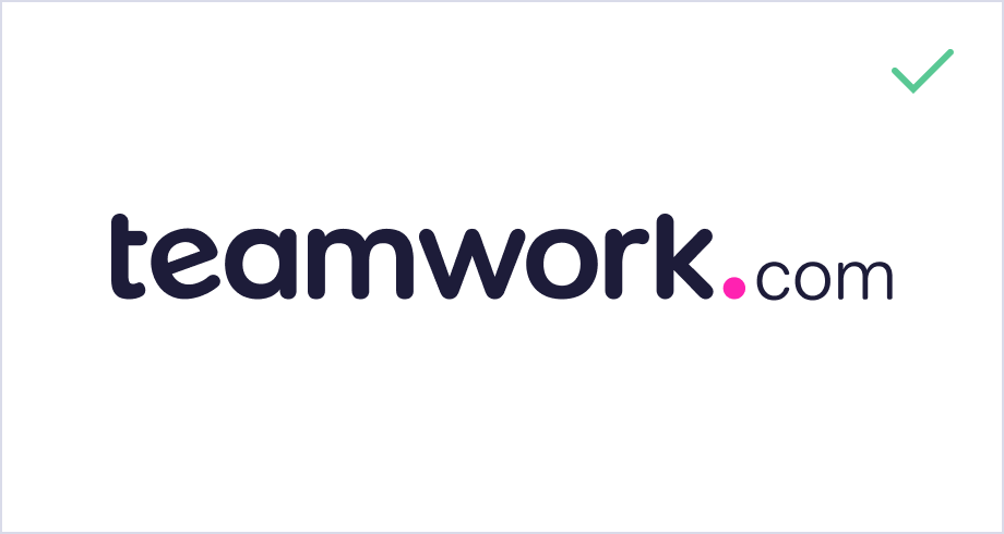
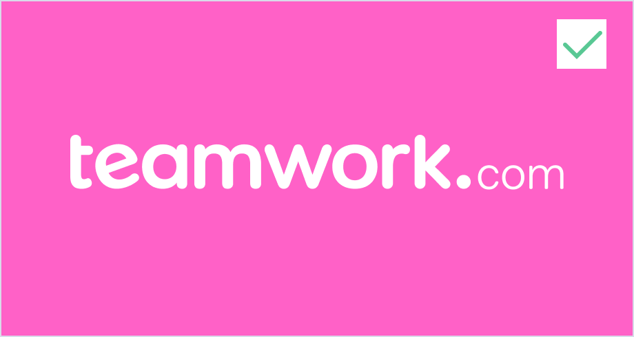
The inverse logo is white with a pink dot. This should only ever appear on a darker background. Make sure all the colors of the logo have enough contrast against the background.
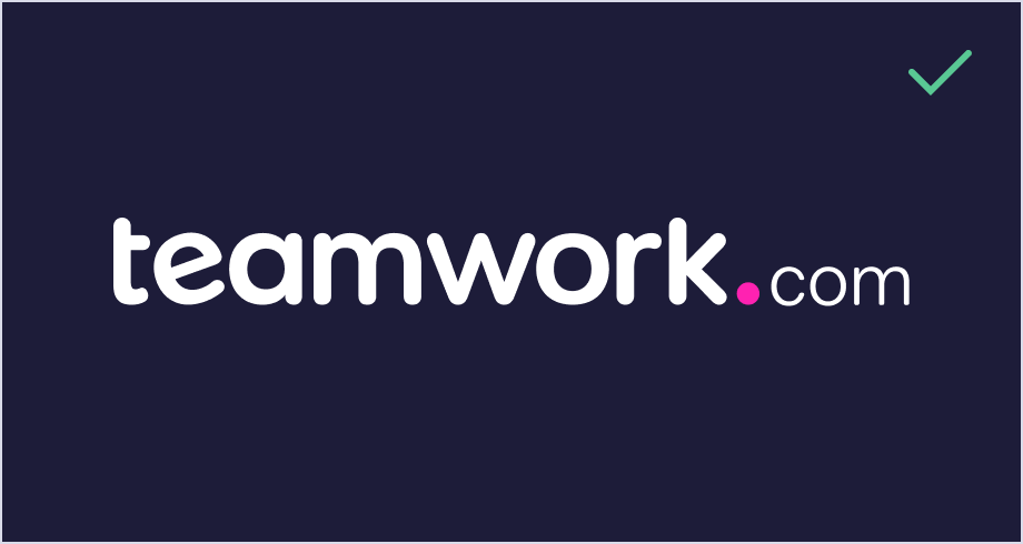
When there is not enough contrast for all the colors, use a one color version of the logo. All white, all slate, or all black.
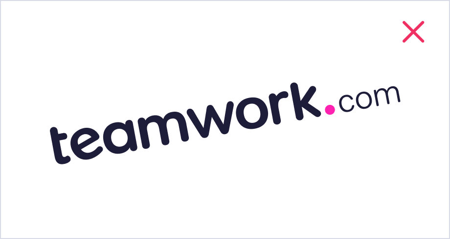
Don’t add effects to the logo, for example. shadows, gradients or characters.
Don’t stretch or compress the logo.
Don’t rotate the logo.
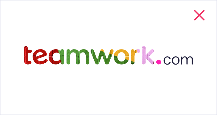
Don’t fill the logo or elements of the logo.
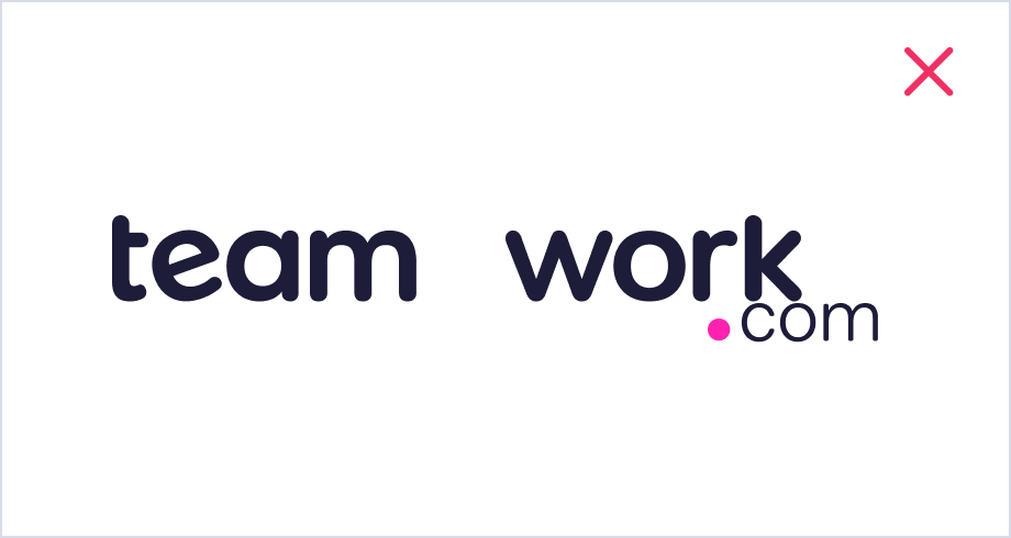
Don’t change the logo lockup.
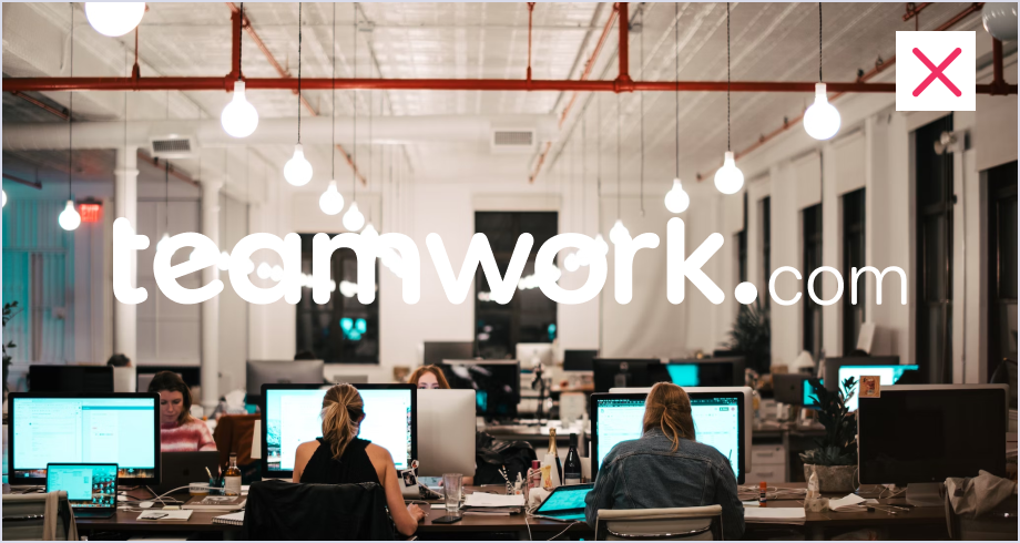
Don’t use the logo on busy backgrounds.
Considerations
Our logo is a precious part of our identity so please consider where and when you use it:
Avoid doormats, rugs or anywhere people can walk on the logo — we hate to see it get dirty.
Avoid placing our logo on items like paper cups or napkins — our logo is not disposable.
Avoid placing our logo on food, no matter how good those cupcakes look — we don’t want it to be sliced, bitten, broken up or digested.
Product logos
Using our color palette and treatment, we have a clear and recognizable visual language to help distinguish the products within our suite.


Download Teamwork Desk logo pack in SVG, EPS and PNG


Download Teamwork Chat logo pack in SVG, EPS and PNG


Download Teamwork Spaces logo pack in SVG, EPS and PNG
Usage
Product logos should only be used when you’re speaking specifically about one of our products — they shouldn’t be used when you’re speaking about or using a logo to represent the company.
In our logo, we use lower case ‘t’ and capitalize the first letter of the product name.
The minimum size requirement for the product logo lock up is 47 pixels.
Avoid splitting or altering the logo.
Note to all Partners: if you’re using our branding, you should always use the company logo, i.e. the Teamwork.com logo.
Icons
Product icons should be used sparingly and only where there are size restrictions on using the entire product logo e.g. a favicon.
- Teamwork.com

- Desk

- Chat

- Spaces

Download our icon logo pack in SVG, EPS and PNG
Color palette
We want every interaction to be a joy, so we chose colours that are vibrant, delightful, and uplifting. We’ve listed a full complement of HEX, RGB and PMS colors to ensure consistency across both digital and print.
Primary color palette
tw-pink
HEX#FF22B1
RGB255,34,177
PMS225
tw-slate
HEX#1D1C39
RGB29,28,57
PMS532
tw-white
HEX#FFFFFF
RGB255,255,255
PMSN/A
Secondary color palette
tw-purple
HEX#6438E0
RGB100,56,224
PMS2725
tw-violet
HEX#1F0F4A
RGB31,15,74
PMS2745
tw-orange
HEX#F45721
RGB244,87,33
PMS165
tw-indigo
HEX#6A84ED
RGB106,132,237
PMS660
tw-ivory
HEX#FFF9F2
RGB255,249,242
PMSN/A
Note: The Teamwork.com pink should be used sparingly, never applied to large blocks of text or used on buttons.
Fonts
Fonts
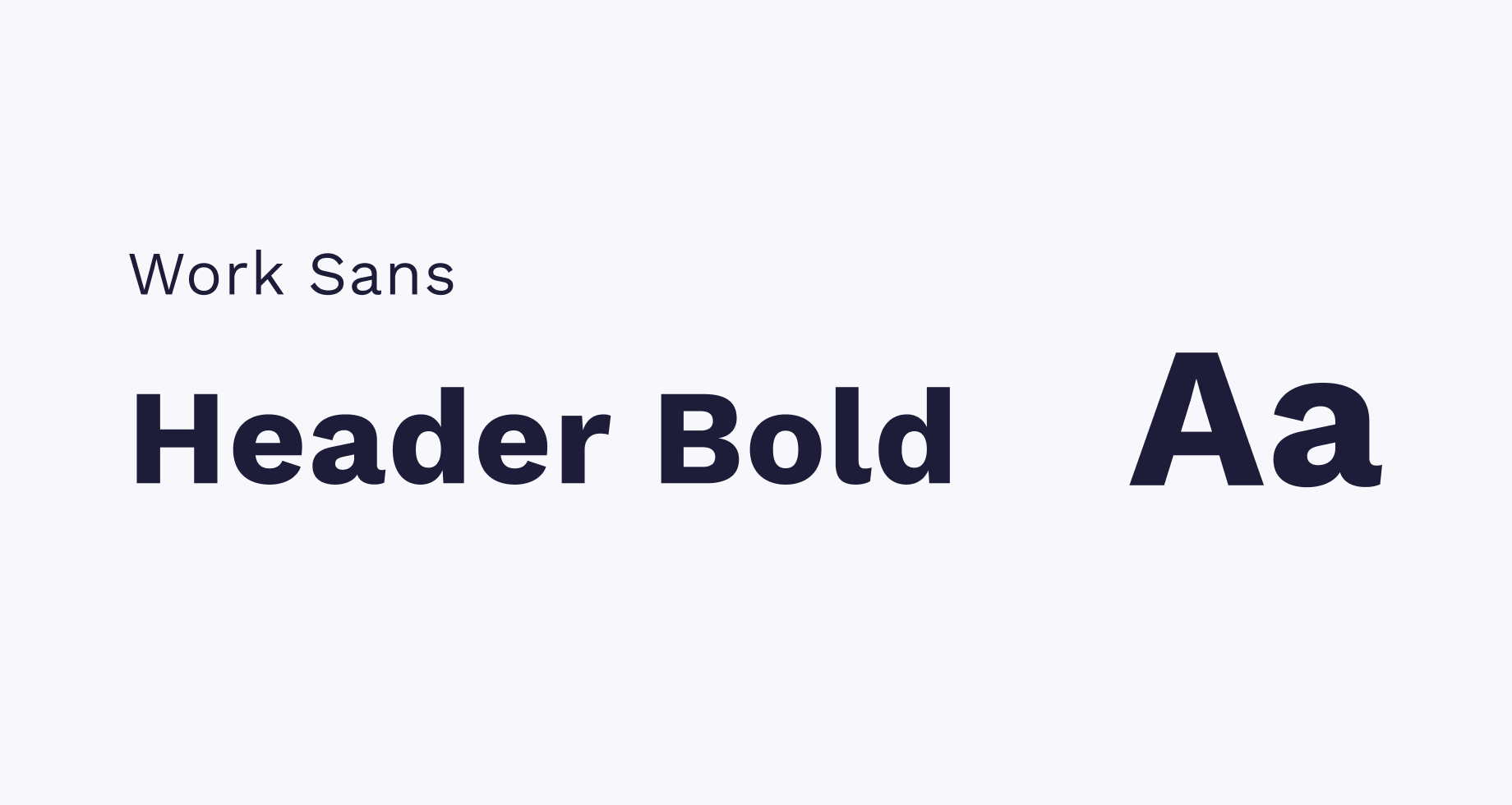
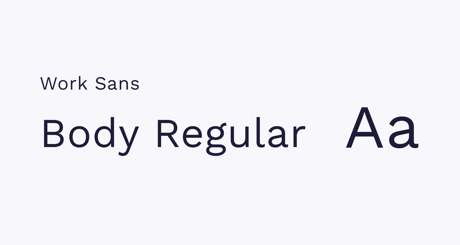
At Teamwork.com, we believe in keeping things clear, modern, and easy to read. That's why we use Work Sans, a versatile Google Font family that reflects our commitment to simplicity and professionalism.
Usage
For headers, we use Work Sans Bold to make important statements stand out with confidence and clarity. For body copy, we rely on Work Sans Regular to maintain a clean and accessible reading experience across all our content. This combination helps create a consistent, approachable tone that reinforces our brand's values across every touchpoint.
Tone of voice
The Teamwork.com brand voice is an expression of our personality. It’s distinctive and unique to us. It’s reflective of our core values and our brand behaviours. Nobody needs additional stress in their day so we want every interaction with Teamwork.com to be a pleasant and memorable one.
Our brand behaviours
Personable & surprising
We’re on our customer’s side, approachable and friendly. Because we’re not corporate, we can delight with the unexpected.
Ingenious and spirited
We’re always looking for new ways of doing things. Our positivity keeps us buoyant and imaginative.
Authentic and adaptable
We approach everything we do with honesty and by being true to ourselves. Through listening to our customers, we’re able to evolve, grow and deliver beyond expectations.